
 USD
USD
 GBP
GBP
 EUR
EUR


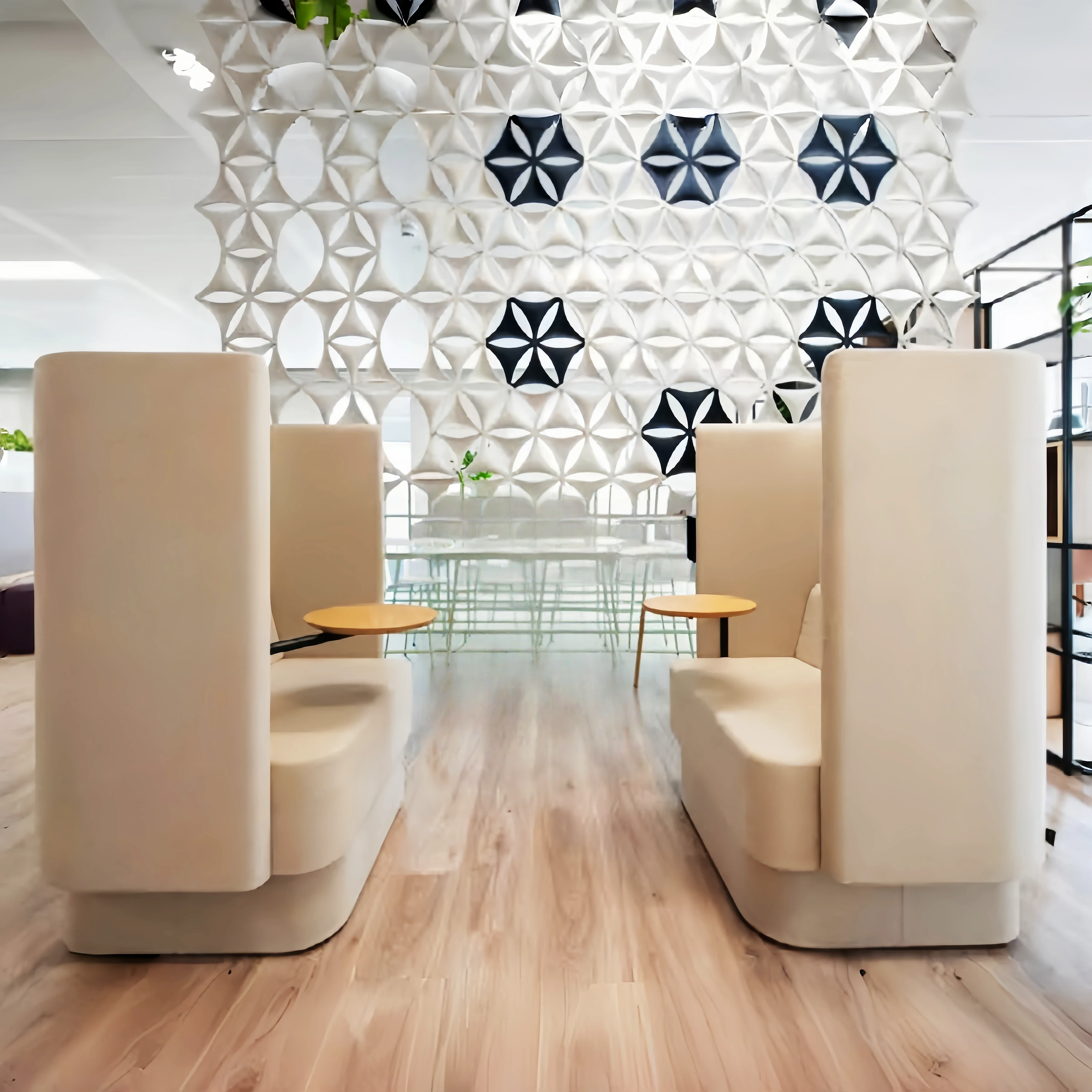


A beautiful home requires a well-thought-out approach to soft furnishings and color matching. The living room occupies a significant portion of the home's color palette, so the furnishings in this area, especially the leather or fabric sofas, require the most careful consideration. Before finalizing a renovation plan, it's crucial to consider its compatibility with the home's style. Only well-matched furnishings create a visually appealing aesthetic and ensure the style, color, and space of the decor harmonize with the style, color, and specifications of the home furnishings.
Xiao Luo has compiled several color combinations that all follow the "631 rule," where 6 refers to the primary color, 3 is the ratio of the supporting color, and 1 is the ratio of the accent color. By following this color ratio, your home's color palette will appear more balanced and sophisticated, giving you a refreshing and comfortable feel.
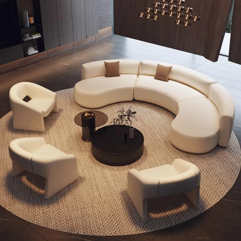
1. Black, white and gray color matching
Black and white are the most basic, simplest, and most classic color combinations. Black is deep and solemn, while white is bright and clean. Gray has a gentle and neutral feel and is a versatile color that can be paired with any color and can also help create a harmonious transition between these two extremely opposite colors.
Large areas of gray and black + a little white
Mainly dark gray and black, it makes the space more high-end!
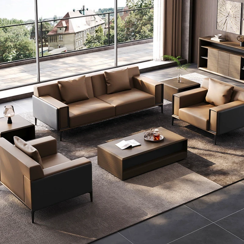
Black, white, gray + wood color (brown)
The black, white and gray scene is matched with a two-meter-long leather sofa in the living room with a natural wood color (brown). It is not only not monotonous, but also adds a natural atmosphere.
It is recommended to maintain a 1:1 ratio between brown and achromatic colors.
Black, white and gray + a little green or blue
In a black, white and gray (original wood color) space, a green or blue egg chair or womb chair (other leisure chair) adds an eye-catching highlight in the simple elegance, which is also a very common combination scheme.
This will make the overall effect less intense, so the purity of blue is generally adjusted, and bright yellow is better for yellow.
2. Pink color combination
When you think of pink, your first impression is that it can only be used in children's rooms, right? In fact, pink is also a very versatile color in the home, and it can also create stunning effects when paired with other colors.
Large area of pink + blue
The collision of cold and warm is not only not inconsistent, but more refreshing.
Large area of pink + achromatic color
The combination of pink and achromatic colors can create a simple and elegant style regardless of the color ratio.
3. Green color combination
Green has always been the representative color of fresh style, symbolizing vitality and youth, low-key and not ostentatious. It is a kind of color that is willing to sink into the ground and use one's own strength to set off beautiful things.
Green + achromatic
Inject the same unobtrusive green into the black, white and gray, especially when arranging one or two dark green or blue sofa pillows on the black, white and gray fabric sofa, or laying green
The sofa cloth is fresh, warm and creates a low-key and high-end atmosphere.
Large area of green + blue
The light green meets the blue, giving the space a natural and fresh feeling.
Conclusion: No matter how big your home is, don't neglect color matching. Save the color schemes shared by Xiao Luo to enhance the appearance of your home and make your life more colorful.