
 USD
USD GBP
GBP
 EUR
EUR
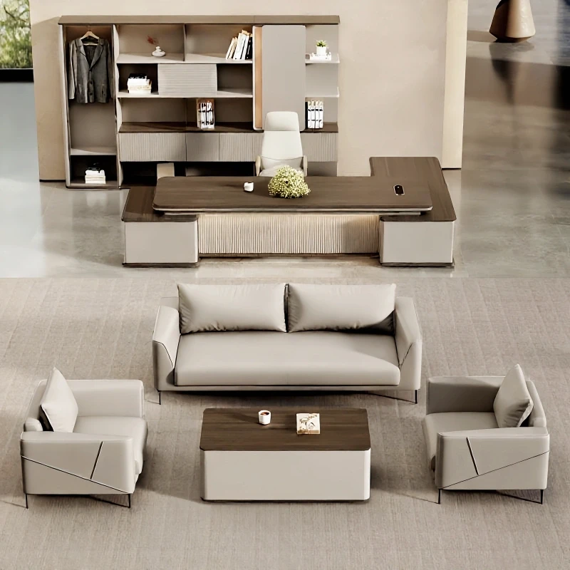


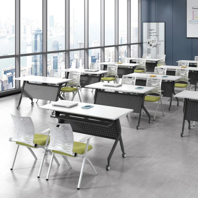


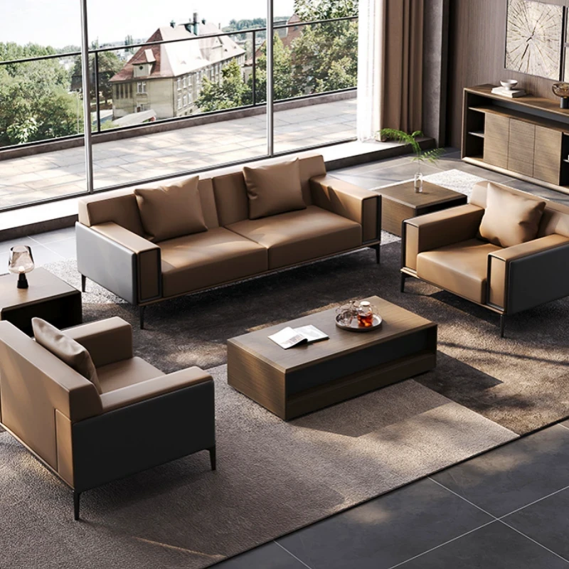


Office Cabinet Design and Functional Expansion for Employees
Oct 09, 2025
The cashier is the final step in a customer's shopping journey. Smart businesses often put a bit of thought into this process, taking some extra cash out of customers' pockets. So, what's the key to a small, compact space like a cashier?
A Cosmetics Observer reporter recently visited several cosmetics stores and single-brand stores in Wuhan's Optics Valley shopping district, including Watsons, Mannings, Guerlain, Golden Dream Makeup, Tang Sancai, Plant Doctor, Herborist, Innisfree, and Lin Qingxuan. They uncovered the hidden secrets of cosmetics store cashiers.
1. Where is the cashier typically located?
As the final stop on the customer journey, maximizing the cashier's effectiveness is a concern for many store owners.
Generally speaking, smaller stores tend to have more secluded cashiers, either located at the back or in a corner.
>>Jinmengzhuang cashier location map
This placement doesn't make sense.
First, customers don't see the cashier when they enter the store, which weakens the psychological cue of shopping and reduces consumers' sensitivity to spending.
Second, in a small store of around 60 square meters, fully utilizing the store's location is crucial, and corners offer greater space savings.
Third, the cashier's secluded location also serves as a theft deterrent.
Fourth, from a feng shui perspective, placing the cashier in the back helps accumulate wealth and prevent it from dissipating, and businesses are very particular about feng shui.
Of course, this statement doesn't necessarily apply to single-brand stores. In several single-brand stores visited by Cosmetics Observer reporters, the cashier was mostly located opposite the entrance.
Upon closer examination, this makes sense. Single-brand stores have significantly fewer SKUs than CS stores. The purpose of a single-brand store is not only to sell its own brand products to customers but also to enhance the brand's influence through its presence.
Therefore, hiding the cash register in a corner is unnecessary. Furthermore, single-brand stores typically display their store logo prominently facing the store entrance. Even if customers don't enter the store to make a purchase, they can still catch a glimpse of the logo as they pass by, strengthening their impression of the store.
II. What to Place Near the Cash Register
The cash register is a place where customers come into close contact when paying, and the surrounding area is also within the sight of customers waiting to pay. Therefore, it's crucial for businesses to consider the placement and layout of products on and around the counter. Effective placement can significantly increase repeat purchases and additional transactions.
1. Behind the Cash Register.
For CS stores, with a wide variety of products and limited display space, they strive to maximize the space behind the cash register. Products typically displayed here include new arrivals of the month, trade-in items, gifts earned through point redemption, or membership bonuses.
>>Mannings Checkout Counter
Because the back counter behind the checkout counter is semi-enclosed, visual impact is crucial for product advertising and display. For this reason, store posters are often displayed.
Watsons is a prime example. Cosmetics Observer reporters found that Watsons often displays promotional posters about membership cards or points next to the back counter, encouraging more customers to become members.
Single-brand stores, on the other hand, naturally avoid cluttering their checkout counters. To demonstrate their class and maintain a clean appearance, they typically feature advertising light boxes or acrylic standees with the store logo behind their checkout counters. Plant Doctor and Innisfree all adopt this approach.
2. The checkout counter island.
The checkout counter island area in front of the checkout counter is closest to customers waiting in line to pay. So, what products should be placed in this crucial area to encourage additional purchases from paying customers? First, they display promotional items, and second, they stack popular products, primarily paper goods, skincare products, and small, over-the-counter cosmetics.
In the center island area of CS stores and personal care stores like Watsons, labels with words like "sale," "hot sale," and "discount" are prominent, and the merchandise on display is carefully selected, typically ranging from 10 to 99 yuan.
By category, these primarily feature daily necessities like skincare and fast-moving consumer goods like facial masks. Due to their low prices and long shelf life, customers also stock up on products for promotional trade-ins.
> Watson's Center Island Display
The center island area of single-brand stores is naturally less condescending. We'll discuss the specific items displayed in these stores below.
3. Near the cash register counter.
Our visits to nine stores, including Watsons, Mannings, and Guerlain, revealed an interesting phenomenon: stores without dedicated men's grooming counters often placed their products near the back of the checkout counter.
After all, women are the primary customer base, and this placement may be intended to make it easier for women to browse and purchase suitable products for their significant others.
Of course, this phenomenon only applies to the few stores our Cosmetics Observer reporters visited and may not be universal. However, it may offer some insights into the sales of men's cosmetics.
It's worth noting that these stores often display seasonal products and personal care products for exchange purchases near the back of the checkout counter. For example, Watsons not only has these products in their designated areas, but also displays them near the checkout counter.
However, the display near the checkout counter should be careful not to overcrowd the items, nor should it include products that require lengthy explanations, as this would create a cluttered and uninspired appearance.
Unlike retail stores, the back counters of single-brand stores generally don't feature open shelves. Instead, they display the brand's product line, with minimal density. To enhance the sense of hierarchy and highlight featured products, the back counters create a perfect display area.
4. Experience Zones Near the Cashier.
With the rapid development of online-to-offline (O2O) platforms, offline stores are adopting a key strategy to capture consumers by providing instant experience services. Both retail stores and single-brand stores are placing increasing emphasis on these experience-based services.
In some retail stores we visited, many of the experience zones served as a complement to cosmetics sales. These zones were mostly located in front of the cosmetics counters, were relatively few in number, and occupied minimal space.
However, this is different for single-brand stores. These experience zones aren't restricted to specific locations and are often located near the cashier.
This placement serves a purpose: After customers pay, sales representatives can more specifically engage with customers through extended experiences. This approach avoids prolonged sales time or customer frustration, and can also encourage new purchases through the experience.
>>The Tang Sancai customer experience area. The back cabinet next to it is the customer storage area, where customers' purchases are stored and regularly maintained free of charge.
During our visits to various stores, the salespersons invited us to try out the store for free. Even customers who didn't make a purchase were warmly welcomed.
Take Lin Qingxuan and Innisfree as examples. Their stores aren't large, but they've invested heavily in their experience areas.
5. Cashier Counter.
The design of the cashier counter depends on its size. Generally, it's not very large, around 1 to 1.2 meters. Except for larger stores like Watsons, which have multiple checkout counters to alleviate checkout pressure and prevent customers from waiting in line.
In addition to payment tools, some stores display a few small, commonly used crossover items, such as exquisite keychains, snacks, sex toys, and tissues, to keep them easily accessible to customers.
A Cosmetics Observer reporter compared the checkout counters at Watsons and Mannings, as shown in the table below:
The merchandise displayed at the checkout counters of these two personal care stores is similar, with two key characteristics: first, they are small, with items occupying a small amount of space; second, they are inexpensive, with prices primarily ranging from a few to dozens of yuan; and third, they are practical, often featuring daily necessities and seasonal specials.
These small, inexpensive, and highly practical items are easy for customers to grab while paying.
In addition to properly displaying items, aesthetics are also crucial for checkout counters. Keeping the checkout counter clean and tidy is merely a basic requirement. Some stores feature hand-painted pop-up displays, willow leaves, exploding cards, balloons, display cases, and floats around the checkout counter to enhance the sales atmosphere and add a touch of flair.
To further illustrate the differences in the layout of the checkout counter area at the stores we visited, we have compiled the following table (stores listed in no particular order):
3. How high should the checkout counter be?
One aspect of checkout counters that's often overlooked by both consumers and business owners is their height. While customers may not notice the height of the checkout counter when paying, a little consideration can create a positive experience.
A checkout counter that's too high can feel intimidating, while one that's too low can make customers feel uncomfortable while paying and hinder the concealment of valuables. So, what's the ideal checkout height for a store?
In our observations, there's a significant difference between cosmetics stores and supermarkets. Supermarket checkout counters are around 70cm high because supermarkets focus on low prices. Low counters allow for more storage, giving consumers the impression that products are cheap and they can buy more.
In contrast, cosmetics stores focus on fashion, and customers rarely purchase in bulk. Therefore, checkout counters are typically around 1.1 to 1.2 meters high. This allows for easy access to items while also avoiding the feeling of being too high and oppressive.
4. What are cash register counters made of?
A Cosmetics Observer reporter researched and found that cash register counters are typically made of wood, marble, fireproof board, and glass. In addition to these four common materials, there are also stainless steel, iron, and plastic-sprayed countertops. So, how should one choose among these materials?
In the stores we visited in the Guanggu shopping district, the countertops were primarily made of wood and marble. Marble countertops are primarily found in CS stores, while wooden countertops are often favored by single-brand stores. Some stores even use tempered glass for their cash registers, placing merchandise underneath for clear viewing.
Of course, the choice of cash register material should also complement the store's overall decor. Comparing the images reveals that wooden countertops have a more textured feel than marble, giving the store a more upscale feel. Marble countertops also have their advantages, being more durable than wood.
Thus, the materials used for cash registers in CS stores and single-brand stores can easily reveal a store's general positioning.
Every corner of a cosmetics store actually has its own unique function. Even the cash register, seemingly just for payment, has its own unique value. Do you know what to pay attention to when you're at a small cash register? Go back to the store and adjust your own cash register!
Subscribe To Our Newsletter
You Can Get The News Of Our Products
SIGN UP
Contact Info
support@Guddorfiss.com
Payment Methods