
 USD
USD GBP
GBP
 EUR
EUR


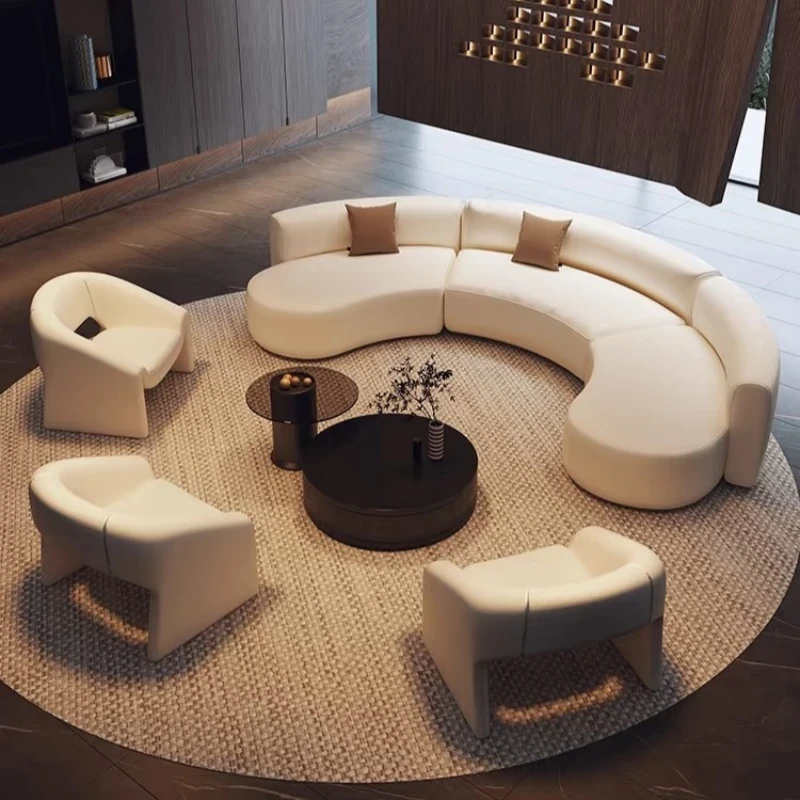


1. Monochromatic color scheme
Using different shades and tones of the same base color in combination can create a tranquil and harmonious atmosphere.
This type of color scheme is often used in bedrooms, where the lightest shade is used for the walls and floors, while the same color is used for bedding, curtains, and chairs.
However, use the darkest shades on smaller items such as cups and vases. Also, incorporate a contrasting element to enhance the visual appeal.
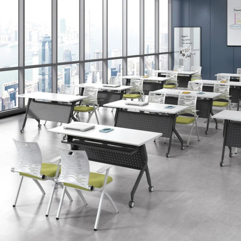
2. Use of complementary colors
Arranging two colors together, such as red and green, or blue and yellow, can create a strong contrast. This color scheme...
It can make a room appear vibrant and lively. It's suitable for family rooms, game rooms, and even home offices.
3. Use of analogous colors
Analogous colors are colors that are very close to each other. They don't clash, so combining them in a room is a good idea.
This can create a more harmonious and peaceful atmosphere. These colors are suitable for living rooms, studies, or bedrooms. For color balance,
Different colors with the same saturation should be used.
The use of black, white, and gray-combining different shades and tones of the same basic color-can create a tranquil and harmonious atmosphere.
This creates a specific atmosphere. This style of arrangement is often used in bedrooms, where the lightest shades are used for walls and floors, and for bedding, curtains, and chairs.
Use the same color, but in a darker shade; use the darkest shade on small items such as cups and vases. Also, choose a contrasting element.
Add visual interest.
Arranging two colors together, such as red and green, or blue and yellow, can create a strong contrast. This color scheme can...
It makes the room feel vibrant and lively. It's suitable for a family room, game room, or even a home office.
Analogous colors are colors that are very close to each other. They don't clash, so combining them in a room can...
This creates a more harmonious and peaceful atmosphere. These colors are suitable for living rooms, studies, or bedrooms. For color balance, one should...
Using different colors with the same saturation
4. The use of black, white, and gray
Black, white, and gray often create striking combinations. Neutral colors like brown and gray have become very popular in interior design in recent years.
The colors are soft and won't give you an overly strong visual stimulus, making them a master choice for creating an elegant space. However, to avoid being too rigid...
To soften a hard, cold appearance, natural elements such as wood tones should be added, or warm colors with strong contrasts, such as red, should be chosen to reduce the original harshness.
5. Color balance
The successful use of contrasting colors relies on good tonal balance. A widely adopted approach is to use one color extensively.
Use cool colors as the main color scheme, then balance them with a small amount of warm colors. Conversely, using warm colors as the main color scheme and adding cool colors as accents can also achieve the same ideal effect, especially...
This design is more suitable for darker rooms.
6. Emphasis on color
After selecting a color for a large area, you can use a lighter or darker color to add detail, such as for corners or edges. Emphasis
Color can be used to create a more harmonious effect in small rooms or apartments with decorative lines.